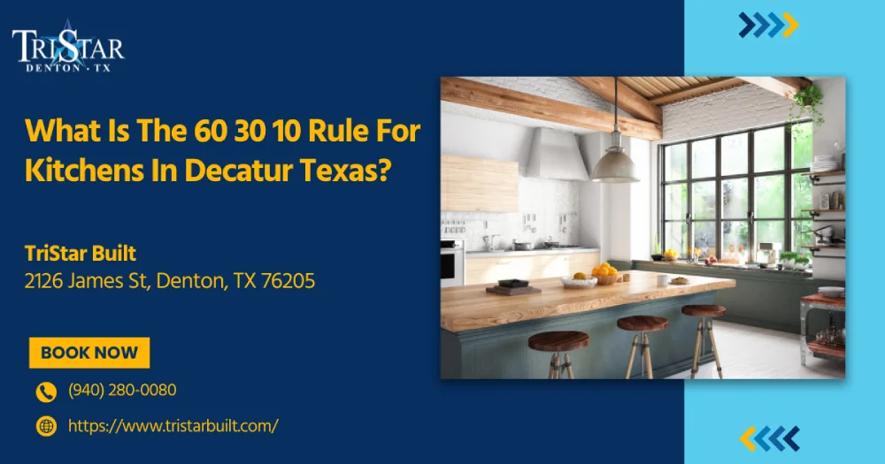
The 60-30-10 rule is a fundamental interior design principle that creates balanced kitchen color schemes by dividing your palette into 60% for the dominant color on major surfaces, 30% for the secondary color on cabinets and key elements, and 10% for the accent color on hardware and accessories.
Bold kitchen colors are dominating 2025 remodels, with 76% of homeowners choosing dramatic greens and blues over traditional neutrals. While these striking palettes create stunning visual impact, many Decatur homeowners struggle to balance vibrant choices without overwhelming their spaces or clashing with existing elements.
The 60-30-10 rule offers a foolproof solution for creating a professionally coordinated kitchen design that balances bold color trends with timeless visual harmony. This fundamental interior design principle divides your color palette into three precise proportions: 60% for the dominant color on major surfaces, 30% for the secondary color on cabinets and key elements, and 10% for the accent color on hardware and accessories.
This comprehensive guide reveals how to apply this proven color rule to transform your kitchen into a cohesive, balanced space that showcases your style while maintaining long-term appeal.
The 60-30-10 color rule represents the most fundamental principle in modern interior design, offering a systematic approach to creating balanced, visually appealing spaces. This proportional method divides color usage into three distinct categories: 60% for the dominant color, 30% for the secondary color, and 10% for the accent color. The rule originated from traditional design principles used across multiple art forms and has become the industry standard because it simplifies color coordination while preventing visual overwhelm.
Human brains naturally seek visual equilibrium, and the 60-30-10 distribution satisfies this psychological preference. The dominant percentage creates stability and grounding, while the secondary color adds depth without competing for attention. Research shows that spaces following this formula reduce cognitive load and create more comfortable environments.
The proportional hierarchy works because it mirrors how we naturally process visual information:
The 60-30-10 rule emerged from traditional art and design education, though its specific origins remain unclear in historical documentation. Interior design professionals began systematically applying this formula during the mid-20th century as residential design became more sophisticated. The rule gained prominence as it proved effective across diverse architectural styles and geographic regions.
Modern design education consistently teaches this formula as foundational knowledge. Professional designers use it as their primary starting point for color scheme development, from residential living rooms to commercial installations. The rule's universal effectiveness across applications has made it indispensable in contemporary practice.
Beyond interior design, the 60-30-10 principle influences fashion, graphic design, and landscape architecture. Fashion designers use similar proportions when coordinating outfits, while graphic designers apply the rule to website layouts and marketing materials. This cross-disciplinary success demonstrates the rule's fundamental alignment with human visual perception.
The versatility extends to different design styles:
Kitchen applications of the 60-30-10 rule require careful consideration of spatial elements and functional requirements. The dominant 60% typically encompasses flooring, ceiling, walls, and countertops, while the 30% secondary color occupies cabinets, backsplash, or large appliances. The final 10% accent manifests in hardware, small accessories, or decorative tile details.
The largest surfaces in kitchens naturally accommodate the dominant color. Flooring often represents the single largest area, making it a logical choice for the 60% allocation. Wall color contributes significantly to this percentage, especially in open-concept layouts where kitchen walls flow into adjacent spaces.
Countertop selection plays a crucial role in achieving the proper proportion. Large kitchen islands or extensive counter runs can represent substantial square footage. Ceiling treatments, whether painted, beamed, or coffered, also contribute to the overall percentage of dominant color.
Kitchen professionals recommend calculating actual square footage when applying the rule:
Kitchen cabinets typically represent the ideal placement for secondary colors in the 30% allocation. Cabinet doors, drawer fronts, and visible cabinet sides create substantial visual impact without overwhelming the space. Two-tone cabinet approaches have gained popularity, with 41% of homeowners choosing contrasting cabinet colors to achieve sophisticated color layering.
The color contrasts between the upper and lower cabinets follow the 60-30-10 framework effectively. Light upper cabinets paired with darker lower cabinets create balanced proportions while maintaining the rule's structure. This approach allows for creative color expression within the established framework.
Cabinet color selection should consider:
The 10% accent allocation in kitchens focuses on smaller elements that provide personality and finish the design. Cabinet hardware, including handles, knobs, and hinges, represents the most common accent application. Faucets, lighting fixtures, and small appliances contribute to this percentage.
Backsplash design offers creative accent opportunities through color, pattern, or texture. Small tile details, grout color selection, or decorative backsplash sections can fulfill accent requirements. Window treatments, artwork, and decorative accessories complete the accent allocation.
Strategic accent placement creates visual flow and draws attention to design features. Range hoods, pendant lights, and bar stools provide additional accent opportunities in larger kitchens.
Current kitchen color trends reflect broader design movements toward biophilic design and wellness-focused interiors. A comprehensive industry survey shows that 76% of homeowners choose green as their top bold color, followed by blue at 63% and brown at 56%. These preferences align with the growing biophilic design movement that emphasizes connection to nature through color and material selection.
Warm earth tones dominate the 2025 kitchen design, with beige, taupe, and sage green leading color selections. These natural hues work effectively within the 60-30-10 framework by providing sophisticated neutrals for dominant placement. Sage green cabinets paired with warm taupe walls and brass accents create balanced, contemporary color schemes.
Natural wood tones, particularly white oak, have gained prominence in cabinet selection. The wood's natural variation provides visual interest while maintaining the calm, grounded feeling that supports the 60-30-10 balance. These organic colors respond to increased consumer interest in sustainable, wellness-focused design.
Successful earth tone implementations include:
• Warm greige walls with forest green cabinets and copper accents• Mushroom-colored countertops with sage cabinetry and black hardware• Taupe flooring with navy cabinets and brass fixtures• Stone-inspired backsplashes with cream cabinets and bronze details
[Highland Cabinetry's 2025 trend analysis](https://www.highlandcabinetry.com/blog/top-6-trending-kitchen-cabinet-colors-in-2025/) confirms that these natural color combinations consistently test highest in consumer preference surveys across multiple demographic segments.
While earth tones dominate, bold color applications continue growing in popularity when properly balanced. Navy blue and forest green represent the most successful bold choices, working effectively as secondary colors in the 30% allocation. These saturated hues provide dramatic impact without overwhelming spaces when properly proportioned.
Bold color success requires careful coordination of accents. Navy cabinets perform best with warm brass or copper accents, while forest green pairs effectively with black or aged bronze hardware. The key lies in maintaining color temperature consistency throughout the scheme.
Contemporary bold applications demonstrate sophisticated color understanding:
Modern color selection benefits from digital tools that help homeowners visualize 60-30-10 applications before implementation. Virtual reality design programs and augmented reality apps allow accurate color proportion testing in actual spaces. These technologies reduce color selection errors and increase satisfaction with final results.
Professional color consultants increasingly use spectral analysis to ensure color harmony across different lighting conditions. Kitchen lighting varies dramatically throughout the day, making color consistency critical for successful implementation.
Commercial kitchen design increasingly adopts residential color principles, including the 60-30-10 rule, to create spaces that balance professional functionality with employee comfort. Restaurant and institutional kitchens benefit from
The 60-30-10 color rule transforms kitchen design from overwhelming guesswork into strategic success. This foundational principle creates visual harmony across any style or budget, from earth-toned contemporary spaces to bold traditional kitchens. Whether you're selecting sage green cabinets with warm taupe walls or navy islands with brass accents, the proportional framework ensures professional results that enhance both functionality and aesthetic appeal.
Successful kitchen remodeling requires balancing color theory with practical implementation and local expertise. The investment in proper color coordination pays dividends in both daily enjoyment and home value appreciation. Ready to apply the 60-30-10 rule to your kitchen transformation? Connect with experienced Decatur remodeling professionals who understand Wise County architectural styles and can develop personalized color schemes that reflect your vision while maximizing your investment.
The 60-30-10 rule for Decatur kitchens allocates 60% to the dominant color for walls, flooring, and countertops, 30% to the secondary color for cabinets or backsplash, and 10% to the accent color for hardware and accessories. Local contractors recommend this formula while considering the Texas climate and Wise County architectural styles, particularly for open-concept homes typical in the Dallas-Fort Worth area.
Cabinet colors typically represent the 30% secondary allocation in the 60-30-10 rule. Choose cabinet colors that complement your dominant wall and flooring colors, and coordinate with 10% accent hardware. Two-tone approaches with contrasting upper and lower cabinets effectively follow this framework, with 41% of homeowners selecting this sophisticated color layering method.
Yes, commercial kitchens increasingly adopt the 60-30-10 rule to balance professional functionality with employee comfort. The rule helps create sophisticated spaces that maintain visual coherence while meeting commercial requirements. Decatur-area contractors like TriStar Built integrate this design principle across both residential and commercial kitchen projects to achieve a comprehensive transformation.
2025 kitchen trends show 76% of homeowners choosing green as their top bold color, followed by blue at 63% and brown at 56%. Popular combinations include warm earth tones like beige and taupe (dominant), sage green or navy cabinets (secondary), and brass or copper accents (10%). White oak natural wood tones also dominate cabinet selections.
Natural light significantly impacts color perception throughout the day, making color consistency critical for successful 60-30-10 implementation. Professional color consultants use spectral analysis to ensure harmony across different lighting conditions. Kitchen lighting varies dramatically, so colors should be tested under both natural daylight and artificial evening lighting before final selection.
Two-tone cabinets work effectively within the 60-30-10 framework by using light upper cabinets with darker lower cabinets for balanced proportions. The cabinet colors combine to fulfill the 30% secondary allocation while maintaining the rule's structure. This approach allows creative color expression, with 41% of homeowners choosing contrasting cabinet colors for sophisticated layering.
The 60-30-10 rule itself doesn't add cost but helps optimize material selection and color coordination. Contractors emphasizing design sophistication alongside functionality command premium pricing. The rule actually reduces costly color-selection errors and increases satisfaction with final results by providing a systematic approach to material and color decisions.
Yes, the 60-30-10 rule works across diverse architectural styles, including Decatur's historic homes from the 1920s to-1960s era. The rule's universal effectiveness allows it to complement traditional design elements while providing modern color sophistication. Choose period-appropriate colors within the proportional framework to maintain historical character while achieving contemporary balance.
The best kitchen accent colors for the 10% allocation include cabinet hardware, faucets, lighting fixtures, and small appliances. Popular choices are brass, copper, aged bronze, and black finishes. Backsplash details, grout colors, window treatments, and decorative accessories also fulfill accent requirements. Strategic placement creates visual flow and draws attention to key design features.
Backsplash can function as either a secondary (30%) or an accent (10%) color, depending on size and visual impact. Large backsplash installations work as secondary color, coordinating with the cabinet selection. Smaller decorative backsplash sections or special tile details serve as accents. Consider existing countertop and cabinet colors to maintain proper proportional balance within the framework.


Whether you’re remodeling a home, expanding a business, or starting from the ground up, TriStar Built is here to guide you every step of the way. With a focus on craftsmanship, communication, and results that last, we make the construction process clear, smooth, and worth every investment.

LOCATION: 2126 James Street, Denton, TX 76205
PHONE: (940) 381-2222
© 2025 TRISTAR BUILT - ALL RIGHTS RESERVED | WEB DESIGN & SEO BY: Authority Solutions®